Introduction
You must consider both size and quality when creating a a blog image. Images have multiple conflicting interests. You must consider the specific blog post topic and the theme of the web site. Next you need to create an image that has a fast load time, often the image must be compressed, or a specific file format and finally it must be a quality image that makes the page appealing. We need to find the right balance and consider all these options.
The most important image of any post is the main image displayed at the top of your blog post. This image is often called the “featured image”. I will explore some of observations that will give you some guidelines and suggestions to create these featured images.
Make note that I will often reference exact image pixel dimentions. They will be displayed in the format of (680×382), meaning 680 pixels x 382 pixels. Generally speaking, you want the length of the featured image to be the wide of the main posting.
General rules for any image
Most often the best way to create a fast load time is to use compress images like jpeg and to use image ratio’s that produce a smaller image. But, smaller images tend to not look as sharp on high resolution monitors. Also, you can try using less colors when making an image.
- Only crop from larger images images.
- When making a custom images, use less colors.
- Only resize larger image to smaller, not smaller to a larger.
- Keep images < 200 kb for fast load time. Max can be 500 kb.
Word Press size recommendations
- Thumbnails 150 x 150
- Medium 300 x 300
- Large 1024 x 1024
Image Resolution
You may see references to this term. Although it is often discussed, I have not personally found it to be a very useful term and do not generally use it when creating iamges. I have included this concern as a reference only, in case you come across it.
Image resolution is often described in dots-per-inch (dpi). Older displays are typically 72 dpi and modern displays are 200 – 400 dpi.
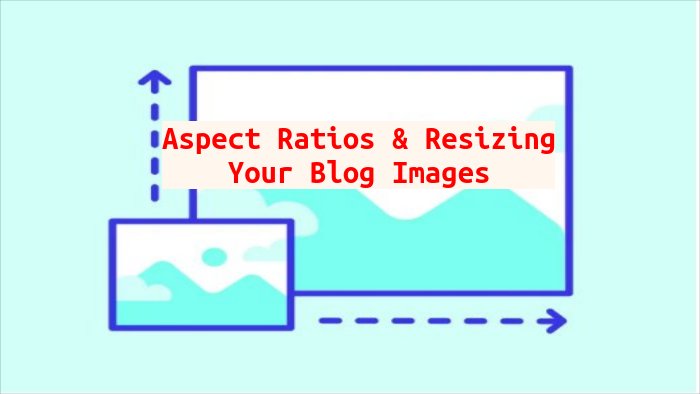
Aspects ratios
I feel that the best aspect ratio is 16×9 or 4×3. I choose based on the type or article I am writing. Ratio is based on wide x height of the image. So, for the fist example it is 16 wide x 9 high. the 800×450 is a good choice if most audiances will be accessiing by mobile devices.
- 16×9: 1200×675 or 800×450 or 680×382
- 4×3: 800×600
- 2×1: 800×400, 600×300, 1170×585 (Slider)
- 3×2: 800×600
- 1×2: 1200×600
- 4×1: 728×90 or 1900×250 (Header)
File Formats
I generally save my files in jpeg format, they have good compression and can saved in native format by most photo editors.
- jpeg = General photos
- gif = Animations and product photos.
- png = Graphics requiring background transparency like icons and logos.
- webP = Product banners, and featured images, good replacement for jpg.
Guidelines
- Background: 1920×1080, ratio 16:9, size < 20 MB
- Header: 1280×720, ratio 16:9, size < 10 MB
- Featured Image: 800×450, ratio 16:9, size <200 kb
- Featured Image: 1200×900, ratio 4:3, size < 200kb
- Banner: 600×160 (regular), ratio 15×4, size < 150 kb.
- Logo: 100×100 (square), ratio 1:1 ratio, size < 100 kb
- Site icon: 512×512, ratio 1:1
References
- https://blog.hubspot.com/website/image-size-for-website
- https://wpjoli.com/blog/best-featured-image-size-wordpress/
- https://calculateaspectratio.com/